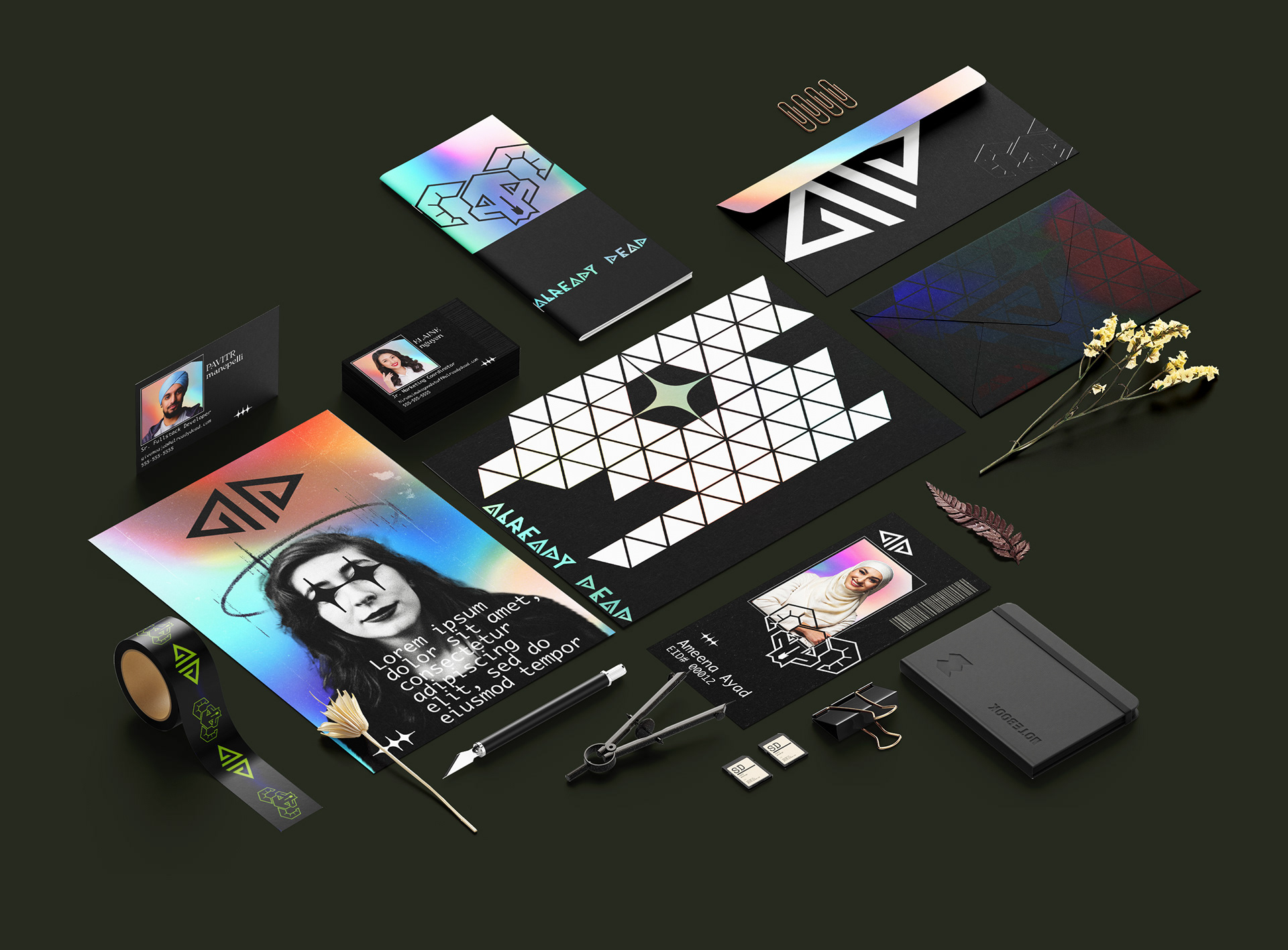
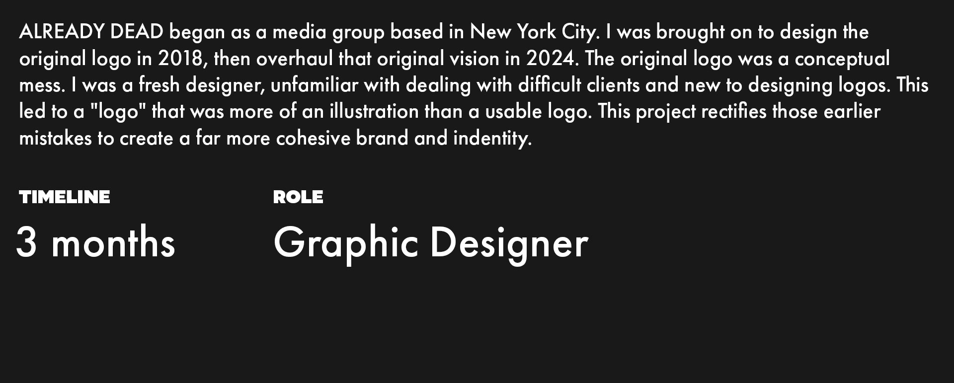
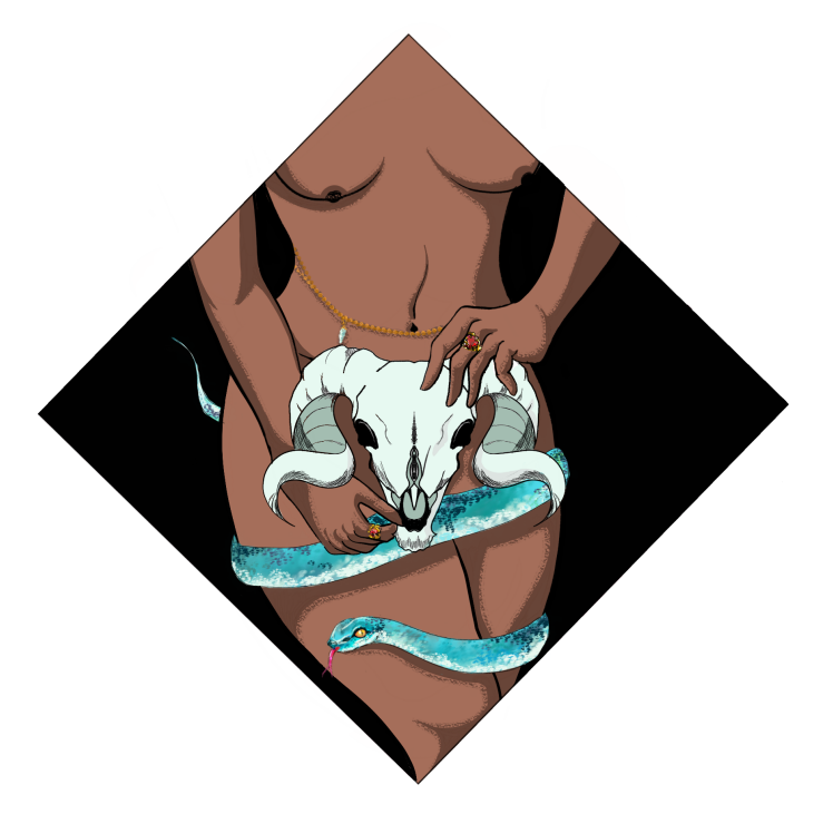
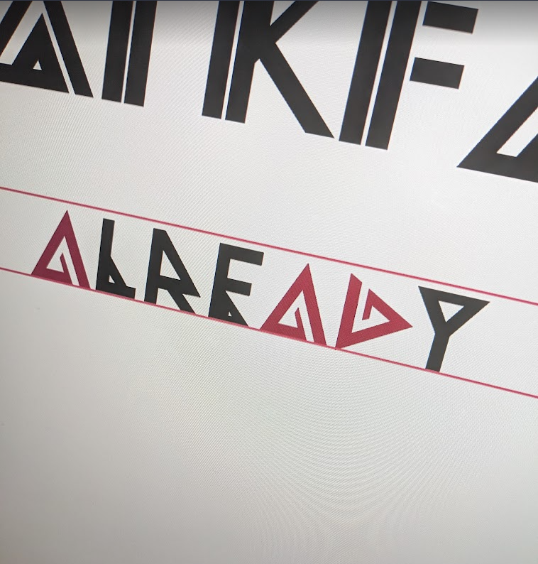

The altered "D" is made of slightly thicker lines than the "A", but at a glance they still appear to be rotated versions of one another. In actuality, they are also mirrored, a choice I made to both better differentiate them and to incorporated them into the logomark as well.
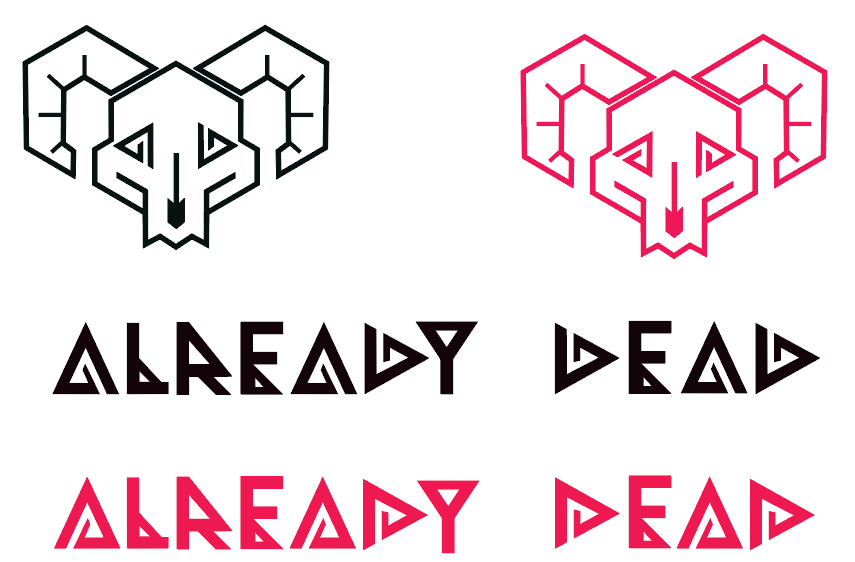
Experimenting with the angles
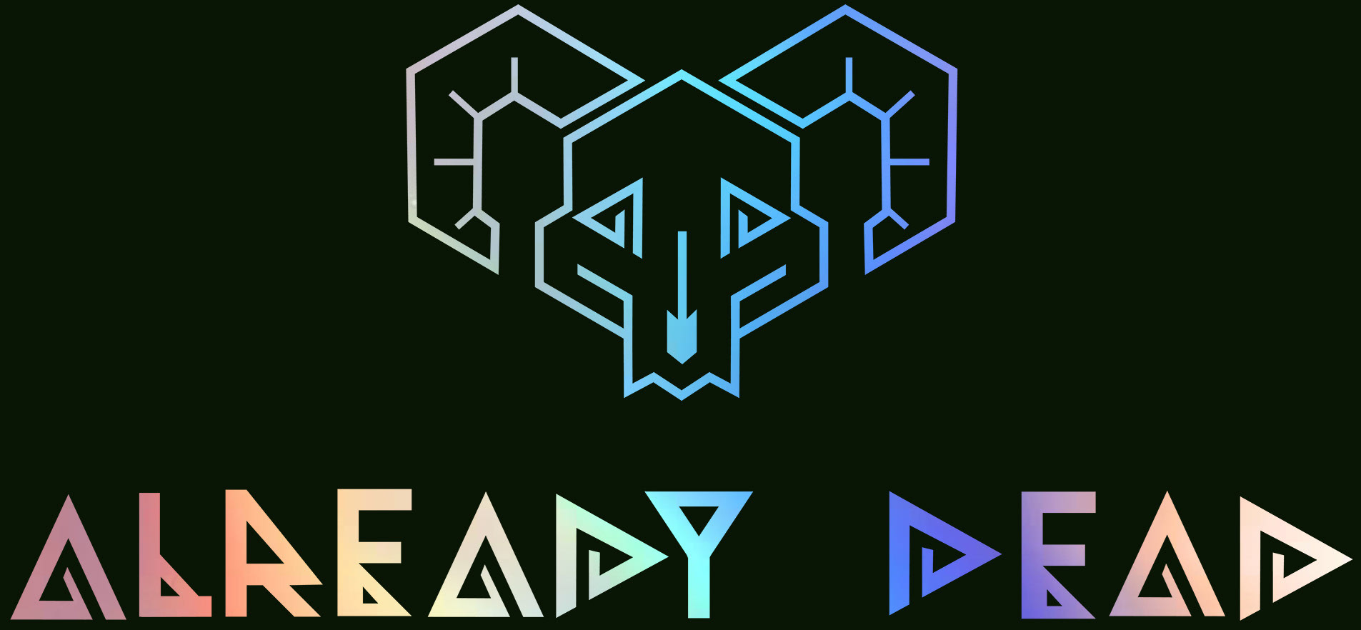
In the end, I created a design that would allow me to repurpose the shape of the "A" and "E" as "eye sockets" in the skull of the ram. This would allow me to take one of the original elements from the initial concept and modernize it for this new challenge. The final design takes the "A" from the BLACK version above and the "D" from the RED version.


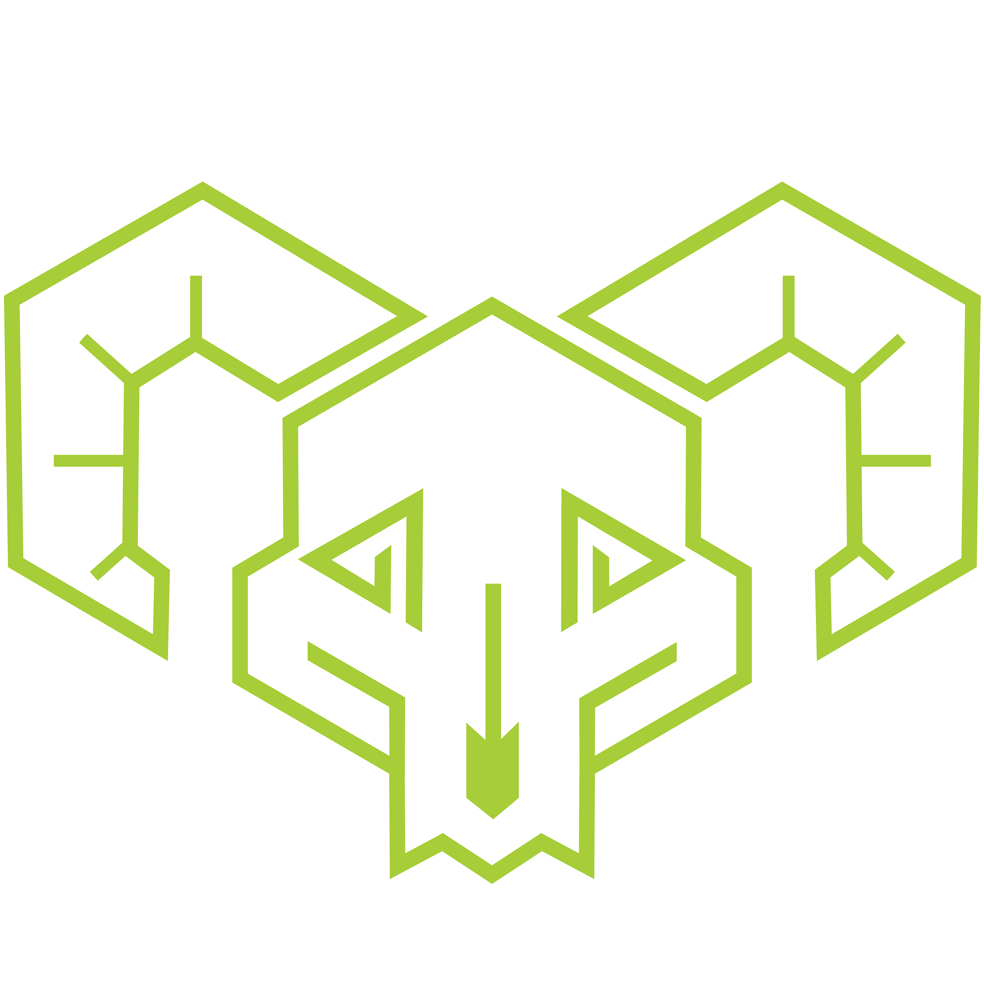
Skull logo with "A" and "D" as the eyes
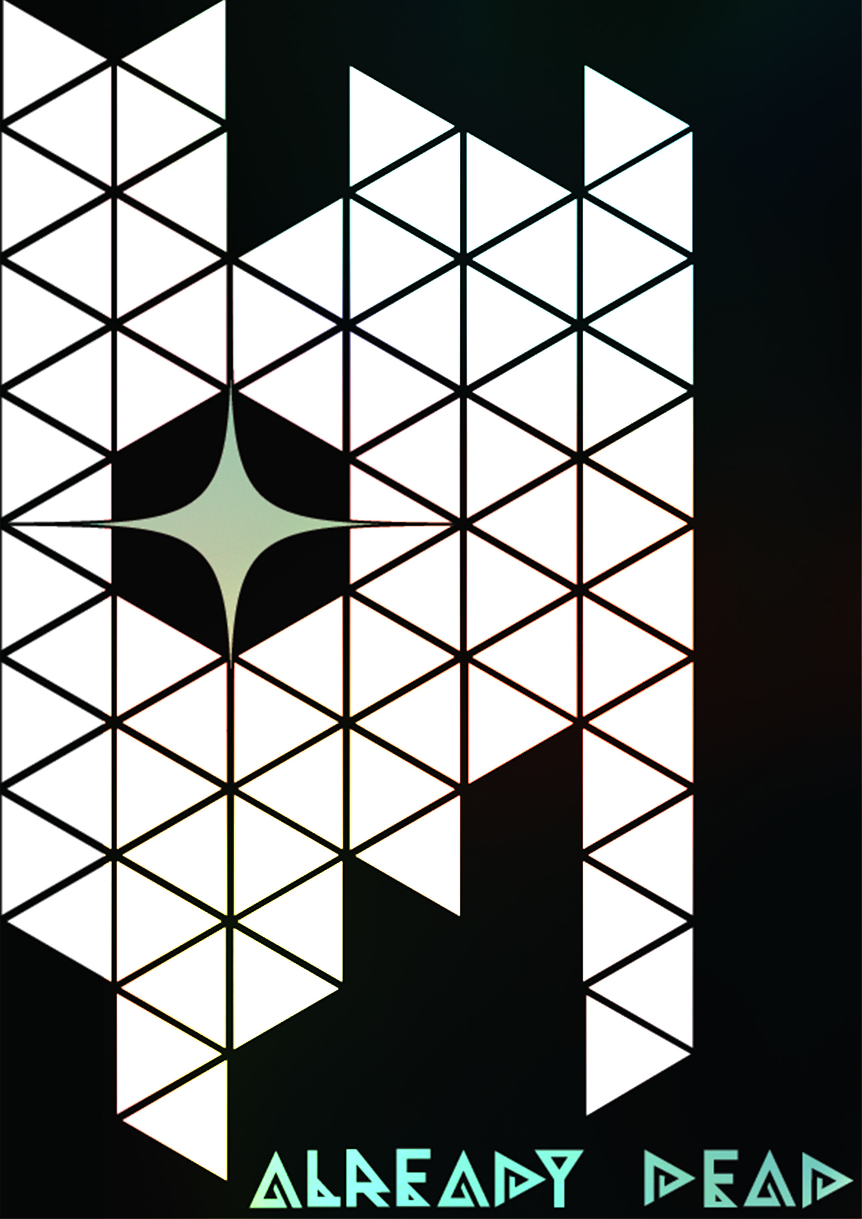
Brand pattern, with full skull and "AD" skull icon